Overview
Calendars are meant to be temporary, functional objects that expire after 12 months. But what if it wasn’t so? What happens when objects transcend their utility? How immortal can aesthetic intention be?
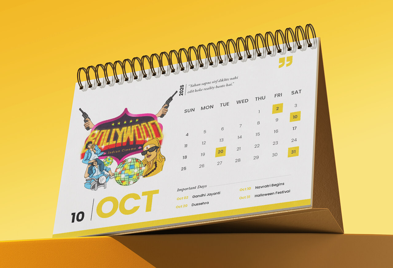
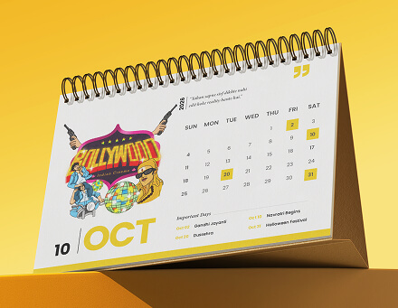
For 2026, we set out to answer these questions by creating an offline brand calendar. What emerged was an emotionally charged narrative, one that explored the relationship between geography and craft.
Concept
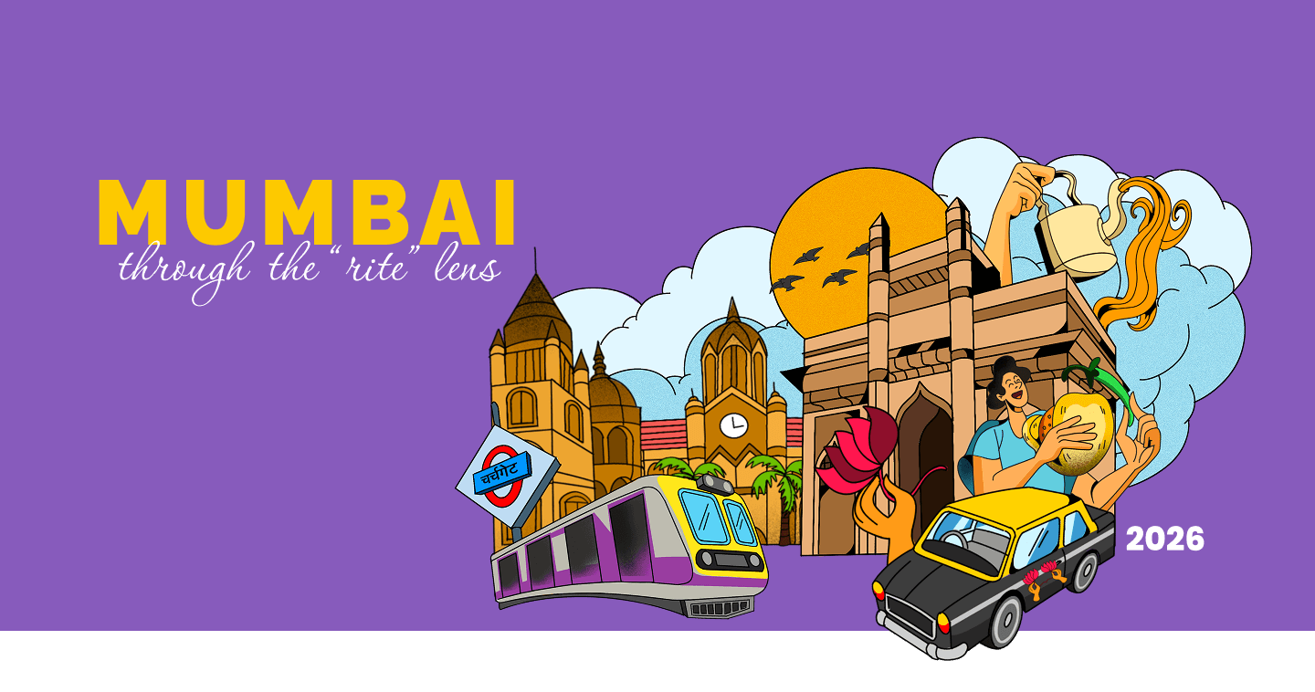
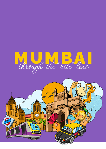
Mumbai in 12 frames
Mumbai in 12 frames was chosen for its proven ability to deliver turn key digital solutions across strategy, content, and design. Our role spanned three to four core ideas.
We used a mind map to examine the anatomy of the city, identifying the elements and places that shape the emotions of Mumbaikars and captivate visitors.
Our Process
We brainstormed, debated, and dug deep into what Mumbai truly means. Its chaos, its flavours, its rhythms, and it’s moods.
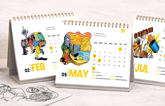
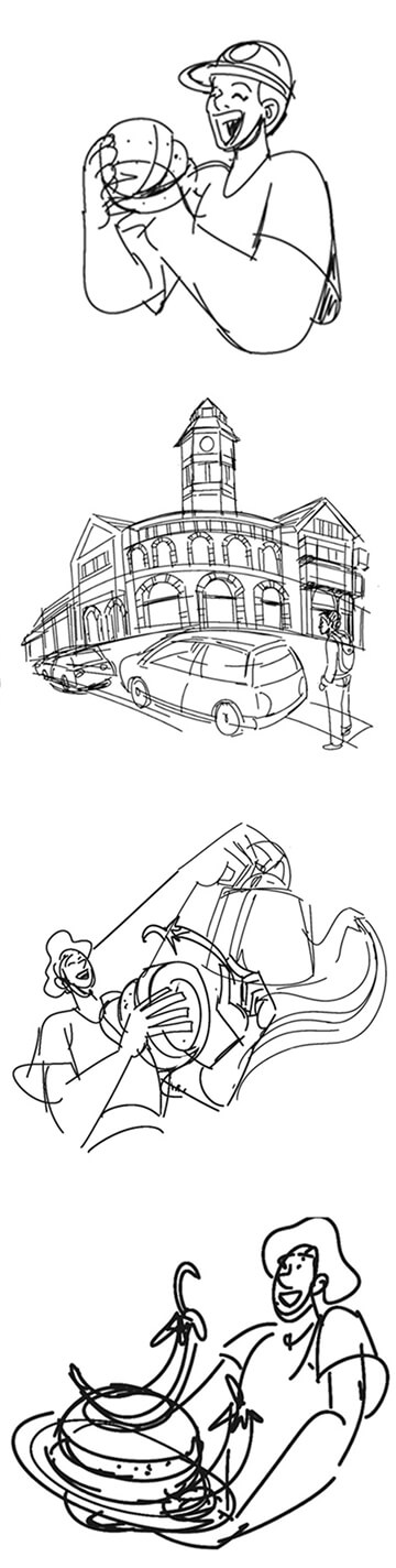
So emerged twelve distinct stories, each capturing a different emotion or bite of the city. From words to sketches, and sketches to illustrations, we carefully translated each feeling into a visual.
Voilà! The result is a year in Mumbai, shown through the lens of art that captures the inevitable spirit of a city that never leaves you.
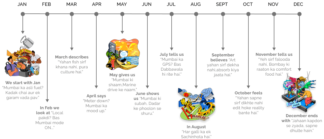
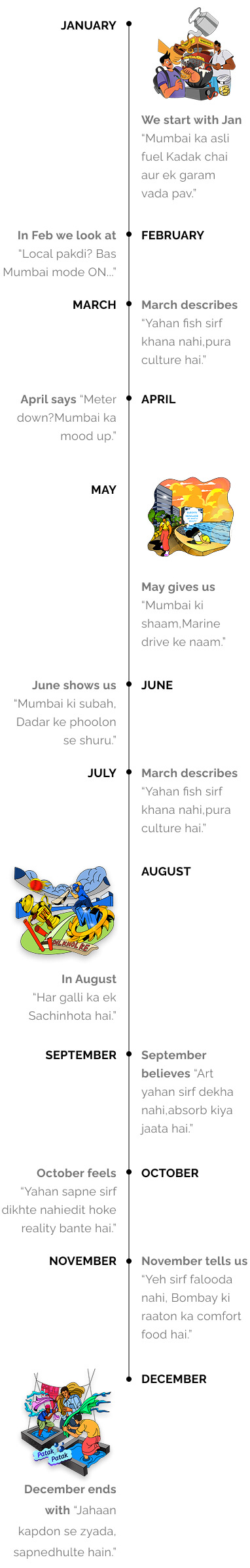
Mumbai, Month by Month
A year in the city, seen through twelve distinct moods.
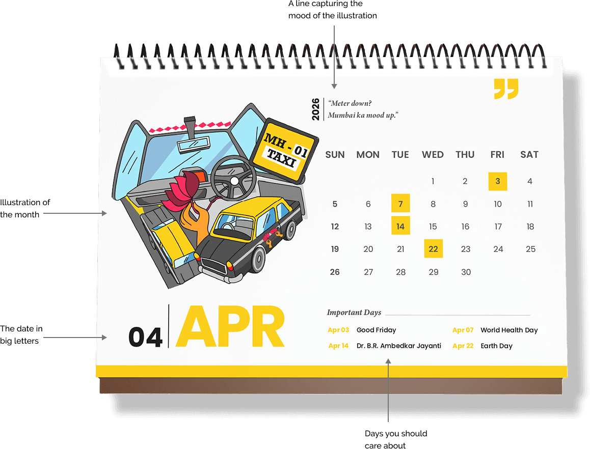
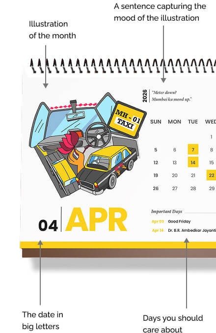
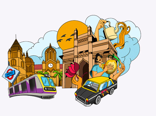
We created semi-realistic illustrations, decked with vibrant colours, to represent the city. The illustrations were aimed at bringing out the essence of Mumbai and its people.
Every Month, Interpreted
Illustrations, inspired by Mumbai’s everyday moments.
In 2026 - change the way you look at stories that live in Mumbai.
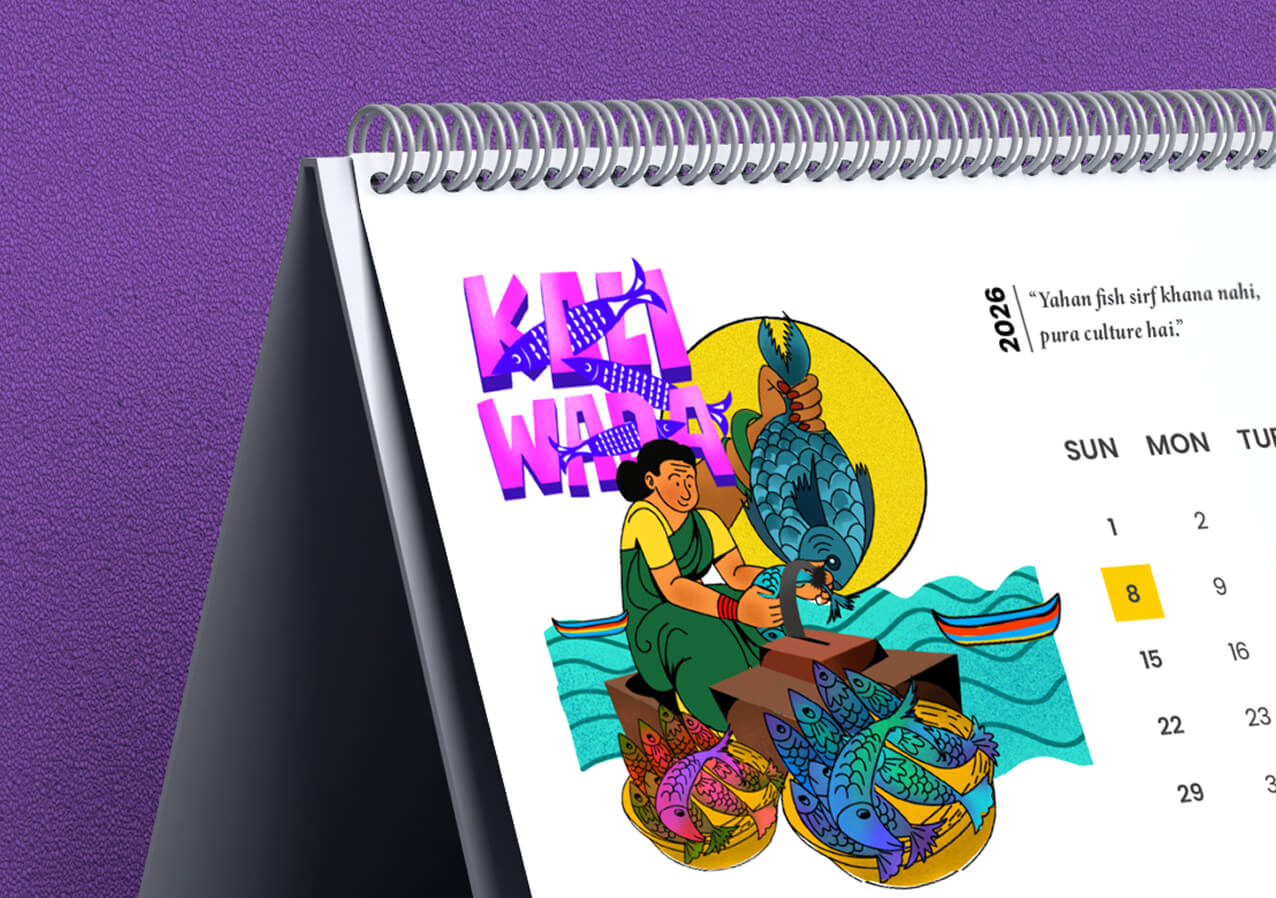
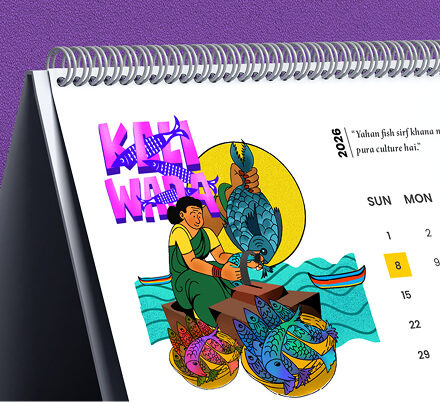
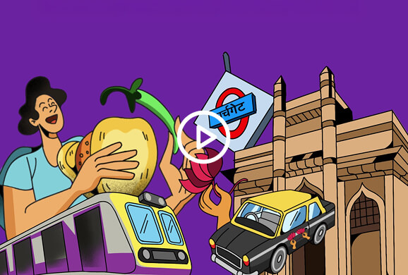
The illustrations use a high-contrast palette that feels playful and unmistakably coastal. The bright turquoise and sea-green waves, for instance, provide an intriguing take on the Arabian Sea, evoking emotions of freshness and movement. Contrasting that are the fish, painted in bold jewel tones like electric blues, purples, yellows, pinks, and oranges, that celebrate the lively and loud nature of Mumbai’s bustling fish markets.
Visual Language
Illustrations, colour, and detail drawn from the city itself.

We used typography to add depth and dimension to the visuals while celebrating Mumbai's multilingual soul, mixing Hindi and English the way the city naturally speaks, creating a typographic rhythm that feels as authentic as a conversation on a local train.
A calendar that brings together emotional landmarks into a visual journey through the city.
Created by Rite KnowledgeLabs
Shapped by the city, we call home.